New and Innovative Web Design Methods
If you are a designer, I am sure you look forward to the New Year because it brings new trends and changes within the design world. All designers look forward to the rising trends or creating a few themselves. Being a designer it is very important for you to keep yourself up-to-date regarding upcoming trends so that you can prepare yourself for them.
These new and innovative trends keep the designing alive, fun and refreshing. Just imaging, following the same old rules, with no new technology incorporated can not only get boring and dull but your design will look out dated as well. As far as 2013 is concerned, we are already two months down and there has been a lot of ongoing discussion on the designing trends. I personally feel that we need to change the definition of trends as we all are quoting predictable trends for instance, responsive designing. Of course, it will be a big trend because of the needs and it was a big trend. We should focus on growing trends because these are the trends that need our attention so that we can really get these trends practiced in 2013.
So, without any further delays, let us take a look at a few growing trends of last year and they are will be growing enormously this year as well.
1. White Space will be a hit:

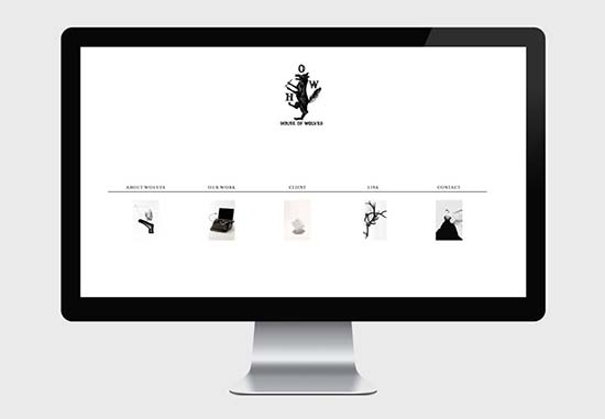
Last year, I have seen a lot of designers practicing ‘less is more’ strategy. There were a lot of designs with a super clean look. From websites to logos to brochures to business cards, every design was neat and clean with minimal designing. I have always said this that using more white/negative space does not make you any less creative. This year, I believe there will be a lot of white space used and that too creatively.
As a designer, you must learn that you do not have to fill every corner of the website in order to prove your creativity. I personally love this trend as websites are not cluttered with design and such design put your eyes to rest. Users’ will be able to understand your website better when they have less distraction on your homepage. Here I would like to mention that you do not have to make an effort to leave white/negative space. Design accordingly and I am sure you will love the design.
2. Usage of fresh colors:

I have always noticed that very few people use light and fresh colors in their website. There have been certain colors that have been among favorites since ever and are used like anything. Blue is one of them and along with that, combination of black and white has been among the favorites. I know, designers love dark themed website but they can surely bring in some change by using fresh and light colors.
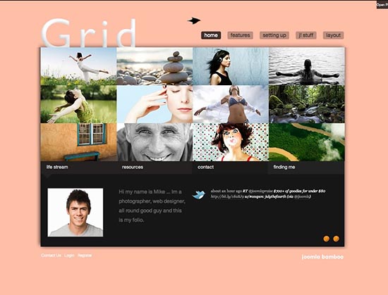
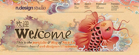
I think in 2013, pink, salmons are going to be a hit for sure. The reason is that these colors make a good combination with almost any other color and the best think is they are pleasing to eyes. People should experiment and I am sure visitors will fall in love with these colors, if used appropriately.
3. Websites going super big:

With all the innovation in technology, designers are no longer designing for monitor screens only. They have to adapt to responsive designing so they can accommodate smartphones, androids and iPhones. So, your website should be easily viewable on small screens as well. Earlier designers were only upsizing a little bit but I guess this year, they have to break the rules and get bigger. I know this is not going to be an easy task for designers but they should do it in order to bring a change. This brings me back to my first point i.e., usage of white space. The less clutter you will have on your website, the bigger your design can get. Start off with trying huge images and then you can increase the size of text as well.
4. Eye catching images:
Thanks to the advancement in technology, you no longer have to adjust with static images on your website. Also, these moving images do not make the website slow anymore so; I believe usage of moving and catchy images will be a growing trend this year. Moving images will obviously add a fascinating touch to your website. Now, it depends on the designers to use the perfect images so that they look good on the website. I was sick of seeing websites with either still images or scrolling images. Now, it’s time to bring something interesting and exciting in the designing world by using moving images and I am sure most of the visitors will love it. It’s a great way to attract attention of the visitors and make them stay for a longer period on your website
5. Forget typical photography:

It’s time to overlook, forget and ignore stock photography since people are no longer interested in it. People no longer want to live in a fake and glamorous world. Give them something real and something they can relate to. Try using real images, adding real stories so that people can see themselves in it. Glamour shots will never help you in developing a real relationship with your visitor.
Although, designers cannot control what sort of images will be used but still they can play an important role in promoting real imagery – images that are more relatable.
Conclusion:
The trends in web designing change like the trends in clothing so; you never know when things change and how they change. All you should do is follow the latest trends and set some new ones. Do not forget; enjoy designing because if you don’t enjoy it, you will never be able to bring out the best creativity in you. Follow trends but you should never be afraid to experiment. You never know, the next big and best thing can be your idea.


A very smart approach to explain the things, I like your step by step tutorial.
Great tips for good practice. It can be hard to create minimalistic websites that really works but like you said in your conclusion, if you enjoy it then you will create some great stuff!
I personally prefer minimalism with style when I visit a new site. This way the message can be sent to the visitors in a clear way and your site will load really fast, what is a must nowadays, because many visitors browse the Interenet with slow mobile devices.
Great article! I completely agree with the photography section – people want to see real people doing real things. I guess it connects them to the site and/or to the site theme.
I agree with you. Minimalistic and responsive websites will be the buzz word in coming days. But for specialized sites, the special effects like animation, auto-change etc. will also be visible specially because it is now easier to implement these.