10 Tips for Mixing and Matching Fonts and Still Looking Great
A mixture of creative fonts can add great dynamism to a website, but it’s imperative that designers know how to combine the variety of styles correctly. Below are ten rules to follow in order to create your own free website that achieves a creative look without causing visitors a headache.

Please feel free to join us and you are always welcome to share your thoughts that our readers may like.
Don’t forget to  subscribe to our RSS-feed and
  follow us on Twitter — for recent updates
1. Too Similar is Too Similar
Let’s start off with one of the more common misconceptions about mixing and matching fonts: yes, you need to find the common ground between styles, but opting for numerous fonts that have only the slightest bit of difference between them can actually create more of a visual mess than using one or two fonts from opposite ends of the spectrum. Stay away from subtle and instead make bold choices, so that the eye can clearly distinguish between sections. As long as you maintain some essential unifying factors (discussed below), this philosophy will yield far better results as you create a website.
2. Remember Family Values
One way to get around the “not too similar yet not too different” predicament is to opt for fonts that come from the same family. If you choose to go this route, it’s essential that you select a font with a larger family of styles so that your options are not too limited.
3. Take Advantage of Itallics, bold, and Underlining Options
As a continuation of this point, don’t forget about the simplest font-alteration options of itallics, bold, and underlining. These easy tools can help create distinction between sections that use the same font, add diversity to a font family, or even help create a unifying factor between wildly different looks.

4. Sans Serif + Serif = Always A Good Fallback
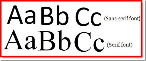
If you’re a creative type, you’re probably looking to create a free website that includes a range of styles – something which cannot be achieved by simply culling the options available in one font family library. There’s nothing wrong with getting a little more experimental, and one foolproof way to do so is to mix a variety of sans serif and serif fonts together. What’s the difference? A “serif” is the small line that sometimes branches off at the end of a letter; serif fonts have them, while sans serif fonts don’t. Combining the two makes for a mixture of elaborate and sleek fonts, thus providing balance.

5. Size Matters, Color Matters
Keep in mind that size does matter when it comes to combining fonts. In fact, sometimes it’s the most important element in drawing different styles together, since synchronizing proportions will help to create visual order in the midst of very disparate looks. By the same token, using the same color or a range of similar colors for your text is an alternate unifying factor.

6. Remove Excess Noise
Whether you choose to stick to a similar color scheme or size range, the bottom line is that it’s imperative for you to put limits on your range of web page elements and choices. This applies to the non-text page space as well. The more fonts you include when you create your own free website, the fewer other distractions you’ll be permitted; so, those who are looking to mix up their typography will need to choose a calm web page background color and get rid of web page background images.
7. Keep Blocks of Text Simple
At the same time, there are certain portions of the text that should also be kept simple. This applies to large chunks of writing, like paragraphs. It’s best to apply one easy-to-read font to an entire section and not to change the font too many times, if at all, during the course of a paragraph. Doing so makes legibility difficult and can be a major eyesore. It’s best to limit use of the largest and widest variety of fonts to stand-alone sentences or headers.
8. Notice Where the Eye Goes
It’s also crucial to pay attention to which fonts draw attention first and how this guides a visitor’s eye through a page. Be careful not to place highly noticeable fonts in places where they might distract or steal the show from more significant page elements or pieces of information.
9. It’s a Numbers Game
At the end of the day, choose wisely and be exclusive. Quality is definitely better than quantity in this case, so just because there is a plethora of fonts available doesn’t mean that all of them should be used on a single page. Limit your web page design to only a few cautiously selected and combined choices.

10. Get a Second Opinion
It’s always best to show a mockup of your web page template to at least a few trusted confidantes or experts in the field before taking your site live. What may look like great design to you could appear confusing and overwhelming to someone else. The feedback you get will let you know if one too many fonts are being used or if your visitors will have difficulry reading your content. Knowing this ahead of time will allow you to adjust as you create your own free website and make essential changes before it’s too late.


These are very useful tips for a web or graphic designer, As the typography is very important subject in designing field every designer must read this article. Thanks for sharing!
Will surely keep these in mind when i design a logo/website the next time.
Interesting ideas about fonts.
i’ve seen frontpages being mixed with many fonts which made it harder to understand main goal of the website.
As for myself, i prefer color contrast and making important messages/words bold
Great article. Thanks for sharing. I consider myself an ‘okay’ designer, and in the past I’ve always made it a rule to NOT mix serif and sans-serif fonts. You have a good point, though. It does make for better distinguishment to the reader. I’ll give it a shot.