40 beautiful flat ui design inspiration
Following up on my previous article on introducing the best flat ui kit from Designmodo, this article will showcase some of the best inspirational flat ui design. When it comes to the flat ui design, there are a couple of key characteristics that you need to be aware of. First, there is ZERO use of effects such as shadowing that creates a depth effect. Second, flat ui designs are usually clean with crisp lines and bold colors. Third, words are often the focus as the overall UI has a minimalist look about it.
With these characteristics in mind, let’s look at some examples of beautiful flat ui design. Each set of examples are grouped into categories for easy browsing.
Flat UI design for business (software or apps)
We will first take a look at how software and app business design can used the flat ui framework.
Vonn Mobile Material Design UI Kit

Ace iOS 8 Mobile UI Kit

Spell Tower

Most flat ui web design has multiple bold colors, which is similar to the metro ui design. This example uses a single color which creates a sharper focus on the words presented.
Invoisse

Another example of a single color flat ui design. Very striking and great for highlighting one action that you want your visitors to take.
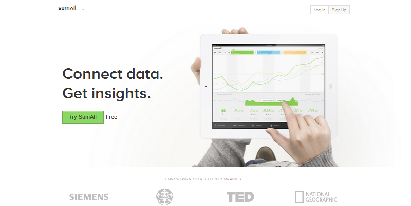
SumAll

An all white web design for a business application. The flat design in this case helps to convey the message that the software is easy to use, without any unnecessary clutter.
Squidee

One of the most minimal design that I have seen for a software website. Nevertheless, the main message is still being conveyed strongly through its flat UI design.
Plover

A minimalist flat UI design. The message is clear and a new visitor will know what the website is all about by reading the text alone. A very good example.
Flat UI design for agencies websites
Advertising or design agencies are among the first business to adopt the Flat UI design trend. As such, it is common to see examples coming from such businesses.
Hum Creative

Bold colors with clean lines. A clear focus on the typography. No depth effect. This is a classic example of a flat ui design from Hum Creative.
Imavex

With the exception of the table which use color tones for a 3D effect, the rest of the page sticks mostly to the flat UI principle. Colors are bright with a focus on clean line and bold text.
OurNameIsMud

With such a nicely executed flat design for their own home page, it will not hard not to be convinced that they are capable of creating beautiful websites for your business.
Fhoke

Just words and a blurred image but the color combination brings everything together into one nice package. The call to action is also very well defined.
MadeByFibb

A metro style inspired flat UI design. There are no 3D effects and the blocks of colors help to differentiate the different sections of the website. Flat design doesn’t always mean boring or minimalist.
Flat UI design for portfolio websites
The next set of examples look at some beautiful examples from portfolio or personal websites.
Roy Barber

A single color theme applied to a portfolio website. It works as the white color screams for your attention. Notice that none of the logos have any 3D or shading effects.
Big Human

An image based application of the flat ui design concept. Nicely done and one for your inspiration.
The Hungry Workshop

Another example of an image based flat ui design. You can use such a design for a photography or portfolio website.
Jake Giltsoff

A minimal and clean site to showcase your work and portfolio. Different colors are used in each block to represent the different areas for the site.
Clinttabone

A white and super clean implementation of the flat design. Hard to put it off with an all white background but this portfolio website has done it successfully.
Flat UI design for conferences
The third set shows how flat design UI can be used for events and/or conference websites as well.
Future Insights

Future Insights implemented the flat ui design nicely on its website. Words are bold and clean, with each speaker being presented clearly.
Build Conference

Build Conference 2012 has a nice flat UI design with bold colors separating each section of the website. Nothing but beautiful typography on the website to deliver its message.
Circle

The word circles might have some hint of shading. Outside of that, the rest can be considered flat design with the use of warm colors and clean lines.
Dropbox Developer Conference

Dropbox is well known for its minimalist design. This event page from them shows the same characteristic. Everything is flat save for the DBX logo.
Lean Analytics Workshop

Beautiful flat UI design for a workshop webpage. The use of the big image does not deviate from the flat design principles. In fact, it helped to act as a powerful contrast for the black and white wording.
Flat UI wordpress themes
If you just want to have a flat UI design right out of the box without doing coding work, then you might like some of these flat UI wordpress themes.
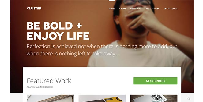
Cluster – Flat ui wordpress theme

A great looking theme with a responsive flat UI design. Best suited as a portfolio website or a personal blog.
Vetro

Another responsive flat UI wordpress theme. Supports a whole range of layouts and customisation. One of the most flexible theme for creating flat UI website.
Essential : A flat ui wordpress theme for business

If you are a business looking for a flat ui design, then this wordpress theme is for you. It featured pre built sections for product showcase, customer testimonials, team profile etc. A very useful business wordpress theme run out of the box.
Stand – A flat design wordpress portfolio theme

Stand is another responsive portfolio wordpress theme that has a nice flat UI design.
Realia – A flat UI real estate wordpress theme

One of the few real estate wordpress themes that use flat UI design. Very little gradient and shading is seen in this theme. Everything is clean and sharp to best view the images and property listing.
Flat mobile UI design
Flat UI design can also be seen in mobile. Here are a few that caught my eyes.
GetThingList

This is a to do list app. Notice all the icons and fonts have no shadow effects unlike what most apps have. This will become more common as mobile designers start to adopt flat UI design in their work.
Fantasy Leagues App

A good example on how to display profile pages using mobile flat ui design. The only thing that is not really flat is the shading on the image. If you removed that, everything else uses the flat UI principle.
Go Travel

A nice combination flat mobile UI showing flat icons and categories.
Coffeely

Displaying menu items in the flat design style can look gorgeous, as shown in the example above. The trick is to use nice typography with lots of space to create the minimalist look.
New Email App Concept

Nice use of flat design in status update. This app is a work in progress showing how email interface can look in an app environment. This can work well for status update as well.
Flat UI design for ecommerce
It is challenging to use flat design for ecommerce stores as most of them want to show depth in their product range. Fortunately, there is a handful of examples that show how this can be done successfully.
Hardgraft

This producer of bags uses flat design to showcase its wonderful hand crafted bags. Using flat design here makes each product almost like a work of art. Very nicely done.
LeRockwood

I never thought using a human model can look so ‘flat’ but lerockwood.com has done it, in a good way. Without the depth effect, the user actually has better focus on the product itself.
Doubeau

A nice way to showcase its only products, which is ties, in a focus and beautiful way. In this case, a flat design UI makes a lot of sense as it is a single product ecommerce store.
FreshProduct

This is a not a pure flat UI design for ecommerce. While everything about the site, including menu, search, drop down etc is all flat UI design, some of the images do convey a 3D or shadow effect.
Snowbird

A nice business website that fully uses the flat design UI. Although it doesn’t have color blocks, everything else is clean and well organized with a hierarchical structure.
Flat UI design for dashboard
It is now more common to see dashboards using flat ui design. I think that is a great trend since a cleaner and more focus design can help us understand the data presented in a dashboard environment.
Concept UI for dashboard

A great concept design for presenting information in an dashboard environment. Using a flat design makes the information much clearer to understand and easier to digest.
VPS iPhone Dashboard

A great example on how to use flat mobile UI design for a dashboard interface on mobile. The main chart is presented sharply using one half of the space while the other half is used to present the numerical info.
Concept dashboard by robbert esser

A very clean and minimalist dashboard. Everything is flat and that makes the data jumped out even more. Great for people just want to focus on the numbers.
Toggl

A new flat UI design dashboard for toggl users. I am sure they will appreciate the cleaner look.
Free PSD file for flat UI dashboard design

Here is a nice freebie from Riki Tanone. If you want free psd files for flat dashboard design, you can click here to down it from Riki’s dribble profile.


