16 cool single product ecommerce design examples
It might seems strange at first to want single product ecommerce design. However, if you consider new things like kickstarter, maker movement, 3D printing etc which makes it much easier for anyone to create a new product, you will understand why there is a demand for single product ecommerce design. These guys don’t want to be an online retailer. They just want to sell their inventions, which is typically only a single product (different colors don’t count!). Similarly, some of the Etsy seller might only have one product to sell and they want to sell it on their own website, in addition to being listed on Etsy.
Hence, for the above folks, here are 16 designs for single product ecommerce design that you can draw reference and inspiration from.
#1: Versatiletrolley.co.uk

This ecommerce sells only their versatile trolley, which is a new kind of trolley invention. The focus of such design is usually on how different this product is from existing competitors.
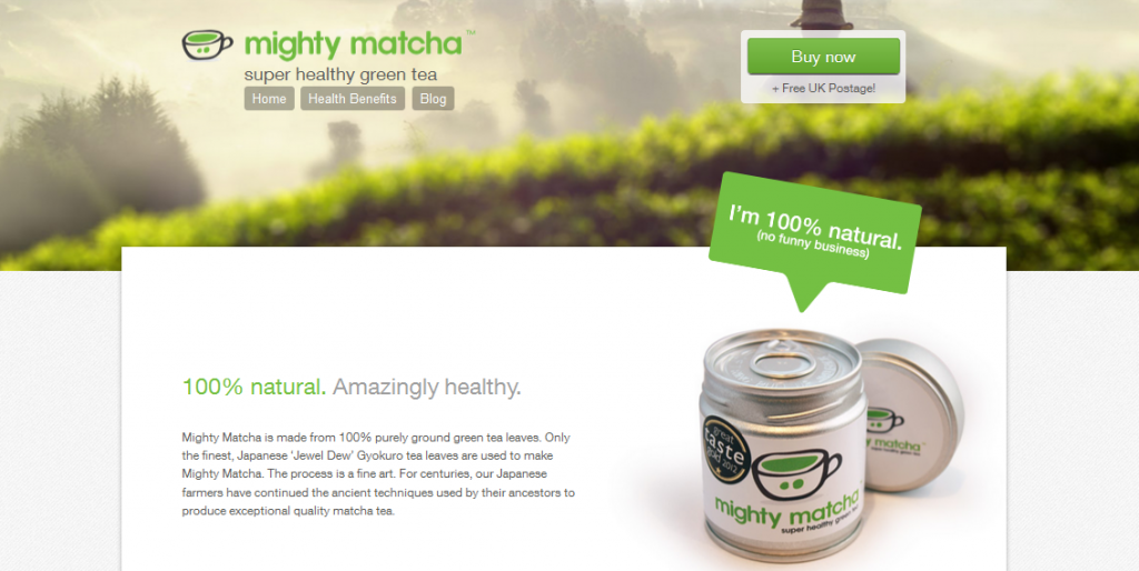
#2: Mightymatcha.com

Another characteristic of a single product ecommerce design is to align the background to the image that the product wants to convey. It is difficult to do so for multiple products since they might have conflicting messaging. No such problem for a single product so a designer should take advantage of this to create a closer relationship between background and product, like what Mighty Matcha did.
#3: Catnaptree.com

Personalised messages for single product is very important. It allows the owner to tell their stories of how they want to make this product. As a designer, you need to make this story telling aspect of ecommerce design more prominently. You can see how this is done from the catnaptree example above.
#4:Hicural.con

Images images images. Since the owner is only selling one product, we need the image to be as clear as possible so that the benefits of the product can be conveyed instantly.
#5: Makefac.es – single page website for products

Apps and software are the most common single product ecommerce design. Most of them typically has only one software or app to sell, thus their selling efforts need to show the benefits of their product really well.
#6: Tricycleterror.com

This ecommerce design uses a nice retro style to showcase its vintage inspired toy. Very nicely done and very well suited for selling the product.
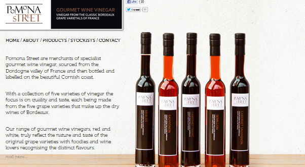
#7: Pomonastreet.co.uk

A very elegant design webpage. This is a single page website for product design that focuses on selling its vinegar. The minimalist style suits the beautiful packaging that this product carries.
#8: Samson-brewery.positivezero.co.uk

Selling only one product means you have more room to play with different layouts and navigation. This can lead to surprising results and innovative web design, as you can see from above.
#9: Julianabicycles.com

Full screen image is great for one product ecommerce design. It is eye catching and pushes the product to the visitor immediately.
#10: Moto.oakley.com

This is another full screen ecommerce theme design. The image used is powerful and leaves the visitor with a strong memory of the website.
#11: Sweetestevia.gr

Combining parallax scrolling with ecommerce design, this website from sweetestevia is a nice example of how both effects can be combined to form a different experience for the visitor.
#12: Dangelicoguitars.com

This one has almost everything. Parallax scrolling, responsive design and full screen sliders. If you take all the current 2013 website designing trend and put in one website, this is what you will get. Pretty cool overall design.
#13: Vool.me

A nice use of black background with clean lines. Such a design puts a strong focus on the product without no other distraction.
#14: Windsonic.com

This example brings together a lot of what I have discussed above. The background is perfectly alined with the single product and the full image is being put to good use.
#15: Muffin-manufaktur-berlin.de

Delicious looking, isn’t? Use your image wisely and your single product ecommerce design can have the same impact as the one above. Take note of the story telling part on the left hand side of the webpage.
#16: Unioncraftbrewing.com

This design uses a fixed header navigation to allow users move around the site regardless of how far they have scroll to the bottom. Very convenient and nicely designed.
You should have noticed by now a key difference between normal ecommerce website and single page websites for products. The former is designed to show you as many different things as possible so that one of them might caught your eye. In single product design, the webpage is focused on creating the desire for that one product. This is why you can’t use a generic ecommerce template for selling a single product.


Great and inspiring selection. Thanks for sharing.