8 smartwatch interface examples and concepts
With Samsung and Sony rolling our their smartwatch in the later half of 2013, there might come a time where designers need to be aware of smartwatch interface design. We are all used to designing for the web. It took us a while but we also master app interface design. Now, with smartwatches potentially taking off, we might be forced to learn how to design smartwatch ui. Given the super small screen, I foresee this to be a major challenge is the trend takes off and there is a demand for smartwatch app designs. If you like to be keep up to date on what are the current UI for smartwatches, here is a round off of existing examples and concepts.
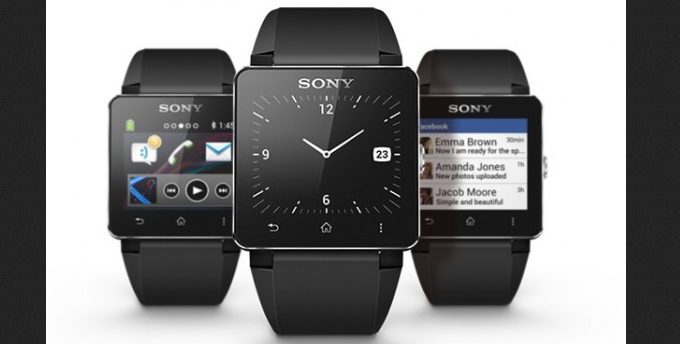
#1: Sony smartwatch Interface

Let’s start off with Sony’s smartwatch. Its design is representative of how a typical smartwatch interface will look like. There will be a time screen, followed by a dashboard for apps and the UI for individual apps.
#2: Android smartwatch interrface

Not to be outdone, Google has also make clear its ambitions on the smartwatch front. Its has released some screenshots of a potential android based smartwatch. Some pretty nice design of circular elements that on the screen that opens up whenever an icon is clicked.
#3: Kreyos Meteor Smartwatch

This is a startup project that is currently in development. It focuses more on using the device as a means to complement your exercise needs. This explains why the interface design look more like a measurement instrument, rather than a dashboard for apps.
#4: Concept smartwatch by Lennart Ziburski


I liked the thinking behind this concept watch by Lennart Ziburski. His main proposition is the a smartwatch is not a smaller iphone. Therefore, how we interact with the device and what kind of info is displayed becomes important. You should read his entire blog post to get some ideas on his main idea.
#5: Qualcomm’s Toq smartwatch UI

Another entrant into the smartwatch category is Qualcomm’s Toq. Its interface is nothing too fancy. Consist of square blocks that represent the different app functions, users just need to touch each block to access the information within.
#6: Apple’s iWatch interface design

Apple’s iwatch essentially look like an iphone. The big different is the introduction of the horizontal scrolling layer that tries to overcome the limitation of the small screen.
#7: Meta Watch UI design

The Meta Watch uses a more clutter look for its UI design. While it may not look as sleek as Apple’s design, the amount of information you can from 1 screen is actually quite plenty. Whether the trend is to go towards minimalist or clutter design remains to be seen.
#8: Motorola’s MOTOACTV interface design

Motorola’s fitness smartwatch focuses on presenting you information relating to your fitness and health. The home screen features a slick runner icon. Subsquent screens shows you plenty of health related information at a glance.
After looking through the through examples, the main challenge still lies in how to reformat our design rules to fit into the small screen. We can still some innovations here but I suspect more will come in the coming months in 2014 .


I like watch when there is different from other s.
Good Post…