20 overused design elements
We have put together a list of twenty over used design elements from many designers point of view to convey the most used design. Some may argue that these are “crutches”, or are they habits that are a must for many?
An overused design could be translated as a “crutch”, which is not entirely a negative thing; however it could to some degree hold you back as a designer. For instance, it can be a solution to fall back on or rely upon when you can’t find a direct solution; hence you use your design “crutch” which saves you time and worry. Some over-used design elements on this list may be debatable, however what an overused element is for one designer may be different to another. It would differ greatly on the type of designer you are, for example App design may use slightly different elements to a website’s homepage.
You may identify with some or all of these over-used design elements, regardless of this, we have included this list for your consideration. It has intrigued us as well as many other designers.
Here is our list of over-used design elements:
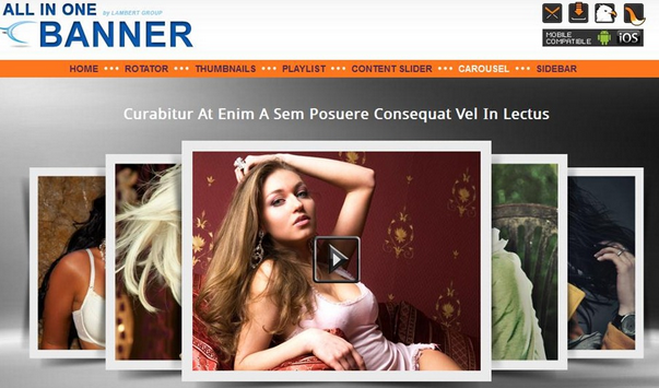
1# Image Sliders and Carousels

It not only does it make a website look professional, giving a central focus, it has the advantage of displaying a multitude of hidden content , giving it equal importance which one would not be able to display all at once.
2# Shadow on Text with 1px drop
Most designers know that shadows are what helps text become more readable over any specific background, making it stand out and look the part.
3# Minimizing anything above the fold
Doing this on any landing page of a website is recommended by many designers so that as much can be seen without users needing to scroll. This may be the case unless you have a specific audience who are already trained to scroll down a page to look for specific information such as results of some sort.
4# Flat designing
Simple compared to creating layers and keeping track of them.
5# Long Shadows
Creates a slightly more 3-d effect than 2-d.
6# Circular Avatars or profile pictures
It may be over-used but they look modern and instinctively more appealing to view with the human eye, according to many designers.
7# Screenshots or mock-ups shown with perspective.
This may mislead viewers into thinking that the screenshots are more polished than they look, whilst the information on the screenshot can remain unreadable.
8# !important
!important used in CSS rules.
9# Sans Serifs
Often used as it looks good.
10# Hamburger style menus
Hamburger menu are usually used to stuff navigational items into it to shift them out of the way,
11# Full Width Background Images
This has been described “like the granite countertops of web design” and is surely overused
12# Tall headers
Simple tall header used with nothing more than a title and image.
13# Menu Toggle Button
The Menu toggle button being applied on all devices including desktop.
14# Grunge Texture
Grunge textures being used such as retro 2003
15# Page Header- Hollow Buttons
These types of buttons are of 1px border with no fill, an overused design.
16# Lines
Used to help organize and separate items
17# Background images
Background images are often overused; sometimes a photograph may be applied and can be blurry and may not look always right when used in this way.
18# Sun rays, rising sun background
The infamous sun rays are overly used as a background of many designs.
19# Dark silhouettes
Black or colored silhouettes are another often over-used design.
20# Reflective objects
The reflective object element was really cool when it first came out, however since it is over used, from the latest tech gadget promote to soft drinks, this has become everything but original and unique.
That’s our twenty over-used design elements. Do you agree with any, or do you have some of your own to add or suggest?
Throughout the years we have seen design trends, which have also been used as design crutches, and they are not necessarily overly technical to use. Some designers may debate this; however anything overused is just that “overused”. We’ve found many types of images used as backgrounds are a great example for this, such as reflective objects, sun rays and shadow elements.
If you’ve found this article useful and entertaining, please feel free like and share with like-minded individuals, whilst also not forgetting to comment and share your thoughts and experiences.


i heard first time about overused design elements. really useful idea for minimize this in web-designing. nice tips for design elements , how it can use effective!!