17 New Best Responsive Frameworks
To all web developers and designers, there are various resources that they can use while establishing a new website. One of which is frameworks, defined as a universal or regulated array of criteria, concepts, and practices to address the typical problems. Hence, if it is defined in the web designing sphere, it is actually a bundle of folders that have standardized codes such as JSS documents, CSS and HTML, and structured files. It is primarily used during the developmental stage of websites using a common structure without redoing, wherein codes can be reused later on. On this list you could see the 17 new best responsive frameworks whether they are classified under frontend or backend. These are the best frameworks that will help web developers in carrying out different processes that pertains to website design. You don’t need mathematical expertise or technical knowledge because it saves time and process becomes easier and quicker.
You May Like jQuery UI Framework, Flexible Grid Frameworks, HTML5 Frameworks and CSS Frameworks
One% CSS Grid
The name itself stands for what it offers since it’s a percentage CSS grid system in a 12-column fluid field, which is recommended to anyone who wants to create a better and responsive base.
MUELLER Grid System
It allows website developers full control of the baseline grid, column width, media queries, and gutter width. It is also adaptable in both responsive and non-responsive layouts.
Profound Grid
This is a flexible framework that works in both fluid or fixed since it is built through SCSS. It gives web developer the ability to add media layouts and creates negative margins for calculation of columns.
34 Responsive Grid System

This is different from other grid system because it provides an equal distributed column allotted for each row. In fact, you could customize, which gives you the freedom to create your download package.
Base
This is one of the best frameworks when it comes to easy and quick customization of stylesheet that has basic styles, fallbacks, and a base enhancement as a default JS file. It measures 12 columns and 960px grid and it’s recommended for a new website because it has a responsive CSS framework.
Blok Grid
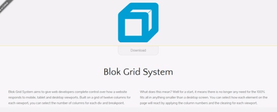
It gives control to web developers as to how their website will respond in desktop, tablet, and mobile since it is the original mobile framework that has a 12 column grid and breakpoint.
Bourbon Neat

It is better known as neat, which is actually built on top of Bourbon and Sass. It is easy to use because of its flexibility since it is an open source fluid type of grid framework, which is also lightweight. It has mixins that aid web designers and developers in running this framework in minutes.
Foundation 4

After it underwent an intensive upgrade for the purpose of making it mobile compatible after a thorough rewritten codes, JS plugins, and a big switched to Foundation from Zepto , it becomes one of the famous frameworks that could replace jQuery.
Groundwork CSS
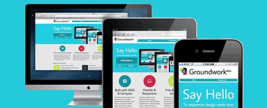
It works in any contemporary layout because its full responsive framework features that compliments better in columns because of its nestable, flexible, and grid system that becomes fluid.
Gumby 2
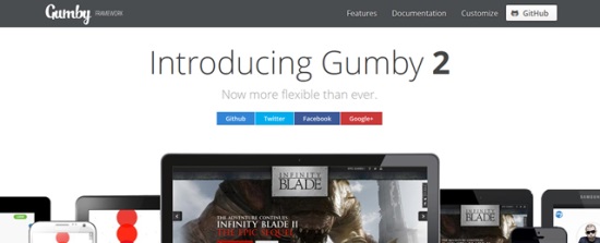
It is the most powerful responsive framework that you could get for free, which is powerfully built in SASS that is known for speed, and full-packed tools for easy and quick customization.
RWD Grid
This is derived from the famous 960.gs that is more developed because the underscore has been superseded by hyphen for easy readings.
Sassaparilla
It allows any web developer to build stylesheets that are flexible since it’s powered by Sass through SCSS which can be reused.
inuit.css
There are variations versions of it, and with this newest version, it becomes scalable, OOCS, powerful, BEM, and Sass-based framework.
Centurion
It is one of the responsive frameworks that is built in CSS3 media queries, and which also uses SASS. It consists of easy to modify scripts and customs for tabbed elements, tables, and navigation.
Cool Kitten

This is recommended in building a responsive parallax website that scroll since it is a JS, CSS and HTML lightweight toolkit.
Extra Strength Responsive Grids
If you want fluid-based and responsive grids, this one will surely work since it can nest your grids, and it has different classes that you could remember easily.
320 and up
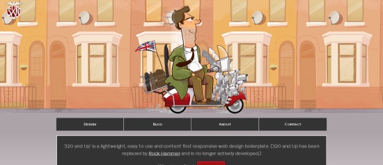
This is best for boilerplate since it’s very responsive and easy to use, since it’s lightweight. Some of the things to anticipate here are its bootstrap, design tester, design atmosphere, 5 CSS3 Media query, Sass maxins, upstarts, responsive type tester, selectivizr, and Modernizr.


They all look good. I still have to decide which one will best fit on my new website.
Have you guys seen the new Ning 3.0 framework for building social networks? If so, i’d love to know what you think of it, compared to the frameworks above.