Learn From UX and Design Mistakes
As a UX designer, when you will start designing, you are bound to make Design mistakes. However, you should never lose heart if you are making mistakes since mistakes are definitely a great way to learn. Always keep one thing in mind; mistakes are inevitable and if you are a learner, you will opt to learn from them. I strongly believe that our mistakes help us in learning, growing and they definitely make us a better person. Also, user experience is the most important thing in any website’s success so you need to make sure you provide your users’ with the best of everything.
Now, as a designer, do not hesitate to experiment and if you end up making mistakes, you should be happy that you will be learning from them and these mistakes will help you in growing as a designer. In this article, I will be enlisting some of the major mistakes that UX designers make and they can definitely learn from it. Also, I will be enlisting a few mistakes that designers should avoid. Hootsuite.com is definitely a great example of a website that is now going in the right direction and focuses on everything that is important.

1. Focus on Retention and not on Revenue
Your UX design mistakes will make you learn that it is very important to keep your customers happy instead of focusing on generating revenues. Your home page or sign-up pages should not prompt users to pay for your website. As a user, it will be a turn off for me if I have to pay for website without having to use it. So, initially you have to focus on retaining your customers’ and for that you need to make sure that your user flow focuses more on user retention instead of revenue. Payment methods and payment flows should always come secondary i.e., when you are sure that your user is happy with your website and is willing to pay for it.
Hotsuite.com is a perfect example for this. Their sign-up screen displays three options for a user i.e., Enterprise, Pro and Free. Now, in Enterprise you can simply request for a demo and pro, although is a paid feature, it still allows you to have a 30 day free trial. Last but not the least, they offer users’ a free sign up.

So, you can understand how they are focusing on winning the trust of the user and then focusing on revenue.
2. Allow users’ to sign in from existing accounts
As a user, I am very lazy when it comes to creating accounts and I guess same goes for 90% of internet users’. I have asked a lot of UX designers and they all learnt that it is better to allow users’ to have social-sign in instead of forcing them to sign up via email. People will instantly sign in if you allow them to use one of their existing accounts. You will definitely see a great increase in the number of sign ups if you allow social sign in because everybody is using social networking websites these days and if you allow them to sign in via those accounts, they will do it because it requires less effort and the whole procedure is quick.
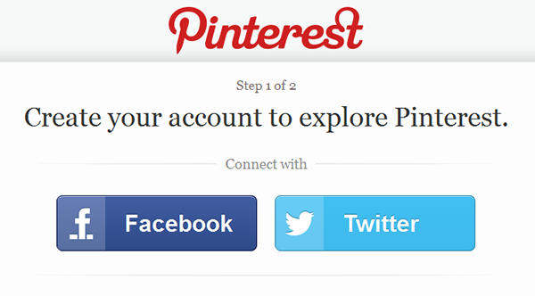
Again, I would like to quote pinterest.com here as they allow users to login or sign-up with facebook or twitter.

3. Testing your assumptions
A lot of designers have claimed that they have a lot of assumptions regarding designs and it is always better to test them. It will save you from a lot of failures.
As a designer, you should try your level best to identify all of the existing issues in your website and then look for the solutions. Also, getting in touch with some real users’ of your website will help you a lot since they can tell you if the problems faced by you actually exist or not. The best thing you can do here is to test your assumptions as early as you can so that you do not have to face many issues.
I strongly believe that our mistakes help us in learning, growing and they definitely make us a better person. Also, user experience is the most important thing in any website’s success so you need to make sure you provide your users’ with the best of everything. Experienced UI/UX design agencies such as Ramotion constantly guided by this.
After Validating your issues or problem, you can quickly change things that does not take longer than 2-3 days to produce. You can show some more useful features about your product which leads more users. Another important aspect about engagement > growth > revenue metrics and discuss to users again about their experience.
Facebook Graph is an example of Recent changed!

4. Waiting for users’ feedback
So, you have designed a website and it is live and if you think this is where your job ends, you are wrong. Waiting for improving your website after users’ feedback is a major mistake that a lot of designers make for sure. Once you have designed your website, try your best to get it tested by professional quality assurance engineers so there is no room for bugs. Yes, users’ will provide you with feedback regarding the navigation or design, but they should not be encountering major issues while browsing through your website since that is a major turn off.
Again, hootsuite.com is a great example as they provide users’ with help desk articles and community forums where users’ can discuss their issues however, the website do not wait for the last moment.
5. Clear UI Labels
UI labels, buttons and website’s text are among the most important things of a website so you have to be very clear in that. Being creative and clever is good however; if your cleverness and creativity is confusing your users then there is no point in being creative. A lot of designers make this mistake in the beginning because they want to come across as creative and different. But with the passage of time, they learnt that it would be better to be clearer rather than being clever. So, as a designer, try to be clear in whatever you design. A user should be able to understand your website and its functionalists in an easy way.
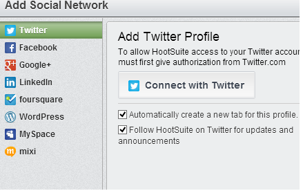
Hootsuite.com has clearly highlighted all social networking websites’ icons for users so they can easily connect and share their favorite posts.

6. Jumping to designing instantly
Okay, so you are new into designing and you are very excited about it but jumping directly into designing is never a good idea. Before you start designing a website, you need to do a lot of research on the requirements of your website. If you have a clear vision of your website’s requirements, you will be able to design a website which is able to provide users with a better usability experience. Jumping straight to designing might waste a lot of your time on things that are not really required so research first and only then start designing.
7. Difference between inspiration and replication
As a designer, getting inspired is good however, replicating and copying design is not good. If you are a newbie, you might be looking for shortcuts to come up with a great design that does not have any issues. However, a design that you are about to copy might look great but will bring a luggage of issues with it. So, design something of your own, get it tested and then go live. Always take inspiration instead of copying blindly.
Conclusion:
I would like to conclude this article with a very simple thought i.e., making mistakes is natural and trust me mistakes help us in understanding things in a lot better way. Above mentioned mistakes can be avoided if you are already aware of them because sometimes it is better to learn from someone else’s mistake however, even if you end up making these mistakes, we hope you learn from them.


very good Information, it help to change our mistakes
Very helpful article about some basics that are often forgotten. Thanks!