Free Data Visualization: 25 Best Tools
Date visualization can be a pain if one is not aware of the many tools one can use in its endeavor. Data visualization is a process wherein data is shown in a simpler way in order for people to understand easily. Samples of data visualization tools include maps, graphs, pictures, and many more. There are many tools like this in the Internet, but none can be as effective as the 25 free visualization tools featured in this list. Some of these free visualization tools are being used for years now, while others are still new in the business. Some of these apps also try to broaden our approach to this quite tiring yet rewarding part of information technology. A few are orthodox and mathematical in nature, while some apps will try to visualize important human elements such as love, joy, hope, and faith. The 25 best free visualization tools are:
Worth to Read : Creating Charts, Diagrams and Flowcharts
25. Wrangler

Wrangler is a free date visualization tool which is used for data cleaning and transformation. Users can now spend less time formatting and use it for more closely analyzing data. Wrangler is specifically made to accelerate the manipulation of data for faster and more accurate readings.
24. Open Refine

Open Refine is a data visualization tool used for working and sorting messy data. It is also used to clean the said data, transform it to another format and extend it through web services. Others also utilize Open Refine to link data bases.
23. Tabula

Tabula is a tool which is used by developers and data reporters to analyze data tables in Adobe Acrobat PDF files. This free visualization program simplifies the complex process of data analysis on Acrobat, which many people dread.
22. NVD3

NVD3 is another data visualization tool, which is used to build re-usable charts and components for d3.js without suppressing the privilege that the said program grants its users. The NVD3 also makes d3.js more customizable and easier to use.
21. Maps

Maps is a unique data visualization tool which can create 2D maps of the Earth. These maps are interrupted at some point, depending upon the wishes of the user. This tool can be used in geographical, astronomical, and physical studies.
20. Wolfram Alpha

This great tool provides netizens a unique and fundamental way to acquire knowledge and answer. This is not your usual website which allows users to ask question and get instant answers. Wolfram Alpha does not use the web to answer queries; rather, it uses dynamic computations through its vast memory filled with data, algorithms and methods.
19. Chart. js

Chart.js boasts that everything that we need to know in creating accurate and effective charts is with them. This tool uses a canvas element, which utilizes a single DOM node. This means that the program has a wider scope for compatibility and less memory implications if compared to rivals.
18. Processing.js
This free visualization tool is a visual programming language designed specifically for website interfaces. Processing.js handles data visualization, digital art rendering, interactive animations, video games, and others. This tool can be used without the hassle of installing plugins. This is a great tool for processing and web developers.
17. Paper.js

This tool is an open source scripting framework uniquely made to create vector graphics. The outputs can then be run through HTML5 Canvas. Paper.js provides its user a better scene graphs and document object model. It is really functional and consistent. This is a date visualization tool that is worth trying!
16. JpGraph

JpGraph is a tool made in able to create efficient and accurate graphs which are object related. This app is web- friendly, supports several plot types, and features flexible scales. JpGraph also has a great capacity for internal caching of graphs, which lessen the burden of the server being used.
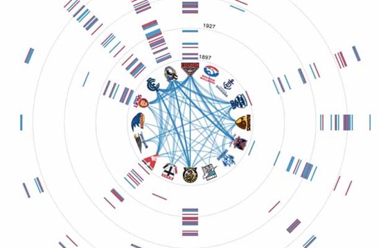
15. Circos

Circos is software which is used for visualizing data and information. It does that in a unique circular layout, which makes Circos a great tool for analyzing relationships between objects and positions. Other features of Circos include high quality info graphics and illustrations, great data- to- ink ratio, and a perfectly layered data and symmetries.
14. Open Heat Map
Open Heat Map is a unique and free visualization tool, which offers a way for beginners to create maps which renders information. This tool helps transform date from a traditional template into a complex and interactive view.
13. Color Brewer 2.0

Color Brewer is another tool which is used to create maps. Nevertheless, the maps made through this software do not depict actual data. It is used as a diagnostic tool for evaluating individual color schemes. This cool tool helps normal people like me distinguish between colors. This is a great tool for artists and students alike.
12. Timeline

This web widget allows users to create beautiful interactive timelines which can catch the attention of anyone.
11. Here is Today

Here is Today is a queer site which is actually a web counter,
10. Time Flow Analytical Timeline

This data visualization tool is a special app which is used to analyze temporal date for future displays. The five displays available are timeline view, calendar view, bar chart view, table view and list view.
9. Data Stories

Data Stories is a special podcast which features different data visualization tools. It is created by two smart and robust information technology experts, who want to share their wisdom to the world at large. Each podcast episode is designed to help others learn about data, statistics, and graphs.
8. Data Journalism

Data Journalism helps us see the importance of data visualization as a storytelling medium.
7. Teaching to See
This site allows visitors to view a video which shows an insightful view on life. Come to think of it, life is the most important data in the whole universe.
6. Better World Flux

This tool is an interactive site where information is visualized on what really matters for human beings. Better World Flux offers cool data indicators such as happiness, life expectancy, education, and many more. It is said that Better World Flux is used to build a consensus of awareness.
5. We Feel Fine

We Feel Fine is a unique site which tries to define the more important data for men. Emotions like love, happiness, and hope are described as if conveying digital data.
4. RSS Voyage

RSS Voyage is a unique app which allows data researchers a cool way to manage RSS feeds.
3. Dipity

Dipity is a digital timeline website which is free to be used by anyone. The people being Dipity declared that their mission is to organize all of the web’s content by date and time. This might sound foolish, but it is truly helpful. Users can use this toll to create, share and collaborate on any Internet data which might be of help.
2. Tag Galaxy

This app can help users connect to hundreds of data tags strewn along the World Wide Web. This is like a search engine specifically made to locate tags.
1. Wiki Mind Map

This great free visualization tool is like a treasure trove of knowledge. It is not an overreaction that any data and knowledge might be available through this mind mapping application. This tool allows users to browse easily among wiki contents.


good job.. some tools are very useful for making to data flow easy…
This list is awesome, some great and useful tools which make it easy to understand data flow.