40 Practical Examples of Responsive Websites
The world of technology has changed a lot over the past few years. Now we are heading towards the so called “post-PC era” — thanks to all the smartphones, tablets and netbooks. All these things have made the work of a web designer a lot tougher. Now web designers are required to make all these devices’ friendly websites. Presently, Responsive Website Design is the thing everyone is talking about. From time to time, we are seeing new and newer web designing techniques, so staying up to date with all of them is extremely crucial.
What is Responsive Website Design?
For all of those who don’t know, let me answer this question in the simplest possible words. Well, Responsive Website Design is nothing new or very different from the fluid or static designs. It simply means using fluid widths in percentages and ems. It even includes scalable images and adjustable layouts, as so to look perfect no matter from which device you are viewing it from. All these things depend on what kind or screen-size you are using whilst browsing any website. Three main elements in responsive web design are Flexible Layouts, Flexible Images and Media Queries. Now what are these things? The answer is given below:
Flexible Layouts
Flexible Layouts means that when a browser width changes,the fluid grids resize and resposition the content accordingly. One of the best free and most handy tools present out there for creating flood grids is Tiny Fluid Grid, so you should give it a try.
Flexible Images
Well, as the name suggests, this means adjustable images.Some of the ways in which you can do it are: You can resize the photos on the go, or dynamically crop the photo. By joining both techniques you allow the photo to resize automatically when it is below a specific size.
Media Queries
Media Queries are just like conditional comments. For instance, one stylesheet is present for large display while different stylesheet are available for mobile devices with different widths. Media queries let you make multiple layouts utilizing the same content. For scalability, CSS media queries are utilized to apply various page styling according to specific parameters, such as, min-width and orientation.
Responsive Website Design has become a really important part of web design. If you own a site, then you know that a large percentage of visitors browse from a mobile browser. So it is obvious that making their experience on your website comfortable and easy is a must.
So today, we have a list of 40 Amazing Examples of Responsive Website Design for you to get inspiration from. All these designs are really beautiful and awesome, and they would look great on any screen-size.
Note: All of the images are linked to their respective websites.
Glitch

Trent Walton

SimpleBits

Skeleton

The 1140px CSS Grid System

See Sparkbox

Lanyrd

Clearleft

The Happy Bit

Webdesign Yorkshire

Stephen Caver

Electric Pulp

Touchtech

ART=WORK

Information Architects

Solo

Designing With Data

Form CMS

Authentic Jobs

Asbury Agile

Cognition

CSS Grid

iaWriter

Miekd

Ethan Marcotte

Bread & Pepper

Spigot Design

More Hazards

Get Skeleton

Earth Hour

Made by Splendid

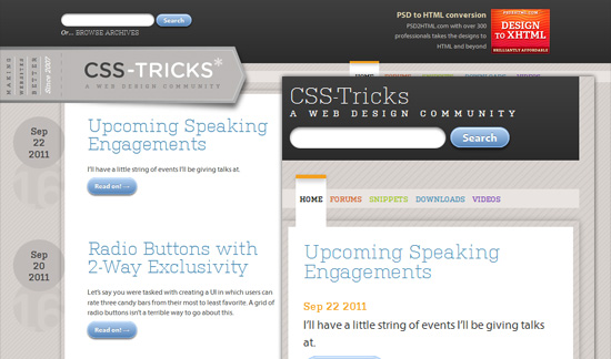
CSS-Tricks
Impact Dialing

Paul Adamsmith

Five Details

Less Framework

10K An Event Apart

Melt Media

Food Sense

51bits


@David Bentley: thanks for your appreciation
and 90% are designers/developers sites…. pity…
how you can say ? would you like to share your thoughts
Great post. Thanks for taking the time to share this. We will tweet on to our friends in the twitosphere.
Regards,
ZeroZen Design