Flat Design VS Metro UI Trend Examples
While designing a website, every designer has his own creative style of doing it. However, some designers go for flat designing and some go to modern designing. Today, we will analyze both kinds and analyze which one is better and why. So, let’s start with flat designing
Flat Design:

In the early years of website designing, flat designs were the only way to go. The reason could be lack of variations. However, now that we have a lot of new and creative ways to design a website, it looks like that flat designs are back in trend. I have witnessed this trend being adopted by every other website and even mobile applications. I will give the credit to Windows 8 and of course the new design of Google for giving hype to flat designing.
Now just because the design is flat, it does not mean it will be dull. Also, most designers think that they should add lots of embellishments to their website in order to make it look attractive. This point of view should be changed now as sometimes ‘less is more.’
Before we go into any further details regarding flat design, let us understand what flat design precisely means.
Concept of Flat Design:
Precisely, flat design is a technique in which no added effects are used to make a structure excluding three-dimensional attributes. Like I said, it is not dull even when it is without any drop shadows or added effects. Elements and icons used are pretty simple yet attractive. So, precisely, flat design is more real and original and it does not have any artificial effects to attract viewers. The designs that are simple are normally called flat designs.
Flat Designing Techniques:
Flat design is minus all decorations and fake beautification When it comes to flat designing, color scheme plays a very important role. In fact, it won’t be wrong of me to quote that color plays an integral part in making a flat design look beautiful. A very important thing that you can do to make your website look beautiful is to select colors from your logo and use them throughout your website. Avoid sticking with the usual black and white theme.
Apart from colors, since your website will be simple, typography should really pop-out. Also, the font is important because the words used are important. We all know that content is the king of any website. If you are keeping your website simple, try to be creative with typography. However, this does not mean that you should go overboard with the text. Make sure whatever font you select, it compliments your website.
Also, try to follow the minimalism theme and keep the content precise and crisply.
Simple UI elements and Icons:
Avoid over-designing your buttons or icons. They should be simple and easy to click. All you need to make sure is that the design of UI elements and icons is simple, self-explanatory and effective.
Flat hierarchy:
Hierarchy is of course very important for any website. So, create a plain hierarchy and make navigation easy for users. Do not make things complicated and user should not be having unanswered questions in his mind when viewing your website. Everything should be clear and understandable.
Now that we have talked about Flat designs, let us take a look at Modern designing.
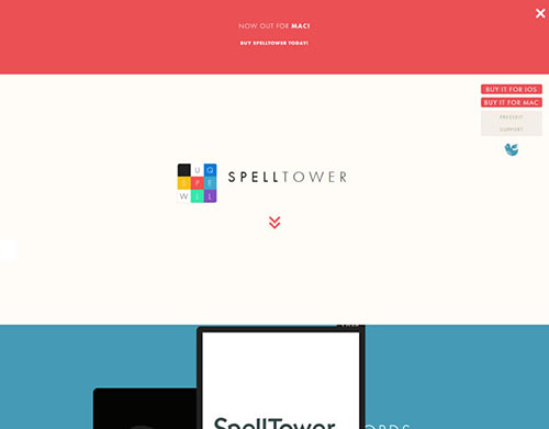
Examples of ‘Flat’ in Web Design
1. Google

2. Windows 8
3. USA Today

4. Spotify

5. Gmail

6. Mailbox


Concept of Metro UI:
Modern or Metro UI is basically a new design language which is gaining popularity after the launch of Windows 8. Although, modern user interface was initially used with Windows7 portable devices but after windows 8, it has caught attention of designers. Precisely, modern Ui design is all about stunning typography. It has less do with graphics and other related stuff.

The main focus of Modern UI design is to improve readability of users and bring a neat, crisp website to the forefront. When it comes to modern UIs, you will see a lot of grid layouts and usage of sans-serif. Since we are quoting Windows 8 as an example of Modern UI, I would like to mention here that a modern UI will not focus on graphical buttons and flashy images. It will focus on content even for the navigational purposes. A lot of people were reluctant about Modern UI initially as they thought focusing solely on content was not a smart move. However, now that we have successful examples, people are going for it without and hesitancy.
Positive Aspects of Modern UI:
If you have used Apple’s products, you must be aware that they are simple yet beautiful. So, Microsoft is finally following the footsteps of Apple when it comes to designing attractive interfaces. If you are a designer and have been trying to design a modern UI, make sure you never compromise on quality. Flat design and Modern designing is somewhat interrelated when it comes to simplicity. However, Modern UI is basically to cater the touch devices that are widely used these days.
We all know that touch laptops are available so Windows 8 suits such laptops perfectly.
Significant Design Essentials for Modern UI:
As mentioned above, hierarchy is very important so you must focus on that a lot. User should be able to grasp the flow of your website from top to bottom without getting confused. Again, Microsoft has used tiles for navigational factors and that is one of the basic principles of designing a modern UI. Keeping a balance between things is an essential for creating a modern UI.
Typography:
As I said earlier, modern UI is all about beautiful typography so make sure you do not neglect this part at all. Since content is the most important thing on any website, you should emphasize on that a lot. Try to keep the text short, readable and easy to understand. An internet user only scans through the text so he should be able to understand the content within a few seconds. If your website offers a quick review of the content, you are on the right path.
Metro UI Style Examples


Reddit Redesign Proposal


Conclusion:
Both kinds are pretty much in trend these days however, flat design is to accommodate all sorts of devices i.e., desktop, laptop and smartphones. When it comes to Modern UI, I personally believe that as of now, it can easily accommodate touch devices but for desktop usage, it might come across as a difficult option. We would like to hear what you have to say about Flat and Modern design. Also, which one would you prefer if you were a designer?


I really like flat design, hope this trend continues.
excellent article
thanks for sharing the comparison of both. your post is very helpful.
i really like this creative comparison and also learn new techniques. thanks
really amazing creation windows 8 and Microsoft was excellent. thanks for a sharing this..